Components
Several Sandpack prefixed components are available in the sandpack-react package. They can be used to build custom presets, as long as they render within the providers we talked about during the previous section.
Let's try to rebuild the Sandpack preset, using the sandpack components available in the sandpack-react package.
Layout
The first component inside the Provider is SandpackLayout. This component ensures the theming is applied and gives your sandpack instance the two column layout with the first child on the left and the second one on the right.
SandpackLayout gives you the left-right split between two components and also breaks the columns when the component is under 700px wide, so you have some responsiveness built-in. It also renders the theme provider for convenience.
Editable example
import {
  SandpackProvider,
  SandpackLayout,
  SandpackCodeEditor,
  SandpackPreview,
} from "@codesandbox/sandpack-react";

export default () => (
  <SandpackProvider template="react">
    <SandpackLayout>
      <SandpackCodeEditor />
      <SandpackPreview />
    </SandpackLayout>
  </SandpackProvider>
);
Preview
Further now we have pretty much the same component as the preset, minus the prop passing, which you can decide based on your specific needs.
You can easily swap the two components inside the SandpackLayout to get a different instance of Sandpack.
Editable example
import {
  SandpackProvider,
  SandpackLayout,
  SandpackCodeEditor,
  SandpackPreview,
} from "@codesandbox/sandpack-react";

export default () => (
  <SandpackProvider template="react">
    <SandpackLayout>
      <SandpackPreview />
      <SandpackCodeEditor />
    </SandpackLayout>
  </SandpackProvider>
);
Preview
SandpackProvider accepts a theme prop, so you can pass in your custom theme object or a predefined theme.
Preview
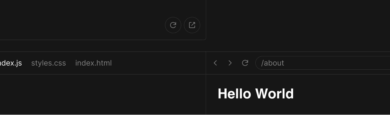
The Preview component is running the sandpack bundler, so without rendering a Preview component you will not have any bundling and evaluation of the code in sandpack. However, the Preview is smart enough to start even if it is mounted later in the page. This is how the autorun=false mode is working.
<SandpackProvider template="react">
  <SandpackLayout>
    <SandpackPreview />
  </SandpackLayout>
</SandpackProvider>
There's nothing stopping you from rendering multiple previews in the same Provider. They will all be connected to the same state source, but they can for example point to different pages of the same application.
Editable example
import {
  SandpackProvider,
  SandpackLayout,
  SandpackPreview,
} from "@codesandbox/sandpack-react";

export default () => (
  <SandpackProvider template="react">
    <SandpackLayout>
      <SandpackPreview />
      <SandpackPreview />
      <SandpackPreview />
      <SandpackPreview />
    </SandpackLayout>
  </SandpackProvider>
);
Preview
Options
| Prop | Description | Type | Default |
|---|---|---|---|
| showNavigator | boolean | false | |
| showOpenInCodeSandbox | boolean | true | |
| showRefreshButton | boolean | true | |
| showSandpackErrorOverlay | Whether to show the <ErrorOverlay> component on top of the preview, if a runtime error happens. | boolean | true |
| showOpenNewtab | boolean | true | |
| actionsChildren | JSX.Element | null | |
| startRoute | Overwrite the default starting route | string | undefined |
Additional buttons
The <SandpackPreview /> component also allows you to add additional buttons to the preview area.
Editable example
import {
  SandpackProvider,
  SandpackLayout,
  SandpackCodeEditor,
  SandpackPreview,
} from "@codesandbox/sandpack-react";

export default () => (
  <SandpackProvider template="react">
    <SandpackLayout>
      <SandpackPreview
        actionsChildren={
          <button onClick={() => window.alert("Bug reported!")}>
            Report bug
          </button>
        }
      />
      <SandpackCodeEditor />
    </SandpackLayout>
  </SandpackProvider>
);
Preview
Additional content
For advanced use cases, children of <SandpackPreview> are rendered at the end of the preview container.
Getting the client instance from SandpackPreview
You can imperatively retrieve the Sandpack client from a SandpackPreview ref, and also consume or interact with the current state of the preview. Check out the type definitions for more details.
import { SandpackPreviewRef, useSandpack, SandpackPreview } from "@codesandbox/sandpack-react"

const SandpackPreviewClient: React.FC = () => {
  const { sandpack } = useSandpack();
  const previewRef = React.useRef<SandpackPreviewRef>();

  React.useEffect(() => {
    const client = previewRef.current?.getClient();
    const clientId = previewRef.current?.clientId;

    if (client && clientId) {
      console.log(client);
      console.log(sandpack.clients[clientId]);
    }
  /**
   * NOTE: In order to make sure that the client will be available
   * use the whole `sandpack` object as a dependency.
   */
  }, [sandpack]);

  return <SandpackPreview ref={previewRef} />;
};Worth mentioning that the SandpackClient will not be instantly available. Sandpack has its own rules to decide when it'is the "right" moment to initialize an instance from a preview component. (Sandpack will take into account properties such as autorun, initMode, and the current client stack priority) This means that it's expected that getClient function returns undefined which is a valid state.
Code editor
The SandpackCodeEditor component renders a wrapper over codemirror, a lightweight code editor we use inside sandpack. If you played with the Sandpack preset, you should be familiar already with the props that you can pass to the code editor component:
Editable example
import {
  SandpackProvider,
  SandpackLayout,
  SandpackPreview,
  SandpackCodeEditor,
} from "@codesandbox/sandpack-react";

export default () => (
  <SandpackProvider template="react">
    <SandpackLayout>
      <SandpackCodeEditor
        showTabs
        showLineNumbers={false}
        showInlineErrors
        wrapContent
        closableTabs
      />
      <SandpackPreview />
    </SandpackLayout>
  </SandpackProvider>
);
Preview
Options
| Prop | Description | Type | Default |
|---|---|---|---|
| showTabs | boolean | false | |
| showLineNumbers | boolean | false | |
| showInlineErrors | boolean | false | |
| showRunButton | boolean | false | |
| wrapContent | boolean | false | |
| closableTabs | boolean | false | |
| initMode | This provides a way to control how some components are going to be initialized on the page. The CodeEditor and the Preview components are quite expensive and might overload the memory usage, so this gives a certain control of when to initialize them. | "immediate" | "lazy" | "user-visible" | "lazy" |
| extensions | CodeMirror extensions for the editor state, which can provide extra features and functionalities to the editor component. | Extension[] | undefined |
| extensionsKeymap | Property to register CodeMirror extension keymap. | KeyBinding[] | `undefined |
| id | By default, Sandpack generates a random value to use as an id. Use this to override this value if you need predictable values. | string | undefined |
| readOnly | This disables editing of the editor content by the user. | boolean | false |
| showReadOnly | Controls the visibility of Read-only label, which will only appears when readOnly is true | boolean | true |
| additionalLanguages | Provides a way to add custom language modes by supplying a language type, applicable file extensions, and a LanguageSupport instance for that syntax mode | CustomLanguage[] | undefined |
Extensions
Sandpack uses CodeMirror under the hood to provide a nice editor. You can extend the editor with any CodeMirror extensions, such as @codemirror/autocomplete.
Editable example
import {
  Sandpack,
  SandpackProvider,
  SandpackLayout,
  SandpackCodeEditor
} from "@codesandbox/sandpack-react";
import { autocompletion, completionKeymap } from "@codemirror/autocomplete";

export default () => (
  <SandpackProvider template="react">
    <SandpackLayout>
      <SandpackCodeEditor
        extensions={[autocompletion()]}
        extensionsKeymap={[completionKeymap]}
      />
    </SandpackLayout>
  </SandpackProvider>
);
Preview
Additional languages
Sandpack provides built-in support for a variety of common languages:
- JavaScript, JSX
- TypeScript, TSX
- CSS, SCSS, Less
- HTML
- Vue
When an appropriate language can't be detected JavaScript is used.
If you want to support additional languages you can extend the editor by supplying a CodeMirror language and associating it with one or more file extensions.
import { python } from "@codemirror/lang-python";

<SandpackProvider>
  <SandpackCodeEditor
    additionalLanguages={[
      {
        name: "python",
        extensions: ["py"],
        language: python(),
      },
    ]}
  />
</SandpackProvider>

<Sandpack
  options={{
    codeEditor: {
      additionalLanguages: [
        {
          name: "python",
          extensions: ["py"],
          language: python(),
        },
      ]
    },
  }}
  template="react"
When using a stream language mode you'll need to convert it into a LanguageSupport instance.
import { LanguageSupport, StreamLanguage } from "@codemirror/language";
import { shell } from "@codemirror/legacy-modes/mode/shell";

<SandpackProvider>
  <SandpackCodeEditor
    additionalLanguages={[
      {
        name: "shell",
        extensions: ["sh", "bat", "ps1"],
        language: new LanguageSupport(StreamLanguage.define(shell)),
      },
    ]}
  />
</SandpackProvider>;
Advanced usage
If you want to interact directly with CodeMirror, use the component ref to access the getCodemirror function, which will return the CodeMirror instance. Check out how to use it:
import { EditorSelection } from "@codemirror/state";

const App = () => {
  const codemirrorInstance = useRef();

  useEffect(() => {
    // Getting CodeMirror instance
    const cmInstance = codemirrorInstance.current.getCodemirror();

    if (!cmInstance) return;

    // Current position
    const currentPosition = cmInstance.state.selection.ranges[0].to;

    // Setting a new position
    const trans = cmInstance.state.update({
      selection: EditorSelection.cursor(currentPosition + 1),
      changes: {
        from: 0,
        to: cmInstance.state.doc.length,
        insert: code,
      },
    });

    cmInstance.update([trans]);
  }, []);

  return (
    <SandpackProvider template="react">
      <SandpackCodeEditor ref={codemirrorInstance} />
    </SandpackProvider>
  );
};
This is especially useful to get the cursor's current position, add custom decorators, set the selection in a specific position, etc.
File Explorer
The SandpackFileExplorer provides a minimal but very powerful experience to navigate through files. You can open and close folders, and open new files.
Editable example
import {
  SandpackProvider,
  SandpackLayout,
  SandpackCodeEditor,
  SandpackFileExplorer
} from "@codesandbox/sandpack-react";

export default () => (
  <SandpackProvider template="react">
    <SandpackLayout>
      <SandpackFileExplorer />
      <SandpackCodeEditor />
    </SandpackLayout>
  </SandpackProvider>
);
Preview
Options
| Prop | Description | Type | Default |
|---|---|---|---|
| autoHiddenFiles | Enable auto hidden file in file explorer | boolean | false |
| initialCollapsedFolder | Initial state of folder (collapsed or not) | string[] e.g. ["/components/src/"] | undefined |
If you're looking for extra feature we recommend using AaronPowell96/sandpack-file-explorer package which support things such as:
- Add and remove files or directories,
- Drag and drop to move files or directories,
- Allow users to customise the entire folder structure right within your website!
- Works out of the box with all of Sandpack's templates.
Tests
The SandpackTests component renders a thin wrapper around Jest to run tests directly in the browser. This means you can run tests but additional configuration may not possible given the browser environment.
Any test files ending with .test.js(x), .spec.js(x), .test.ts(x) and .spec.ts(x) will automatically be run with Jest and the results shown in the SandpackTests component.
Usage
There are two ways to run tests and check out the output:
Sandpack Preset
Using test-ts template preset, which contains an example test.
Editable example
import { Sandpack } from "@codesandbox/sandpack-react";

export default () => <Sandpack template="test-ts" />;
Preview
SandpackTests component
Standalone and configurable component to run tests, which you can combine with test-ts template or supply custom files. For more details about its usage and implementation, check out the API reference.
Editable example
import {
  SandpackProvider,
  SandpackLayout,
  SandpackCodeEditor,
  SandpackTests
} from "@codesandbox/sandpack-react";

export default () => (
  <SandpackProvider template="test-ts">
    <SandpackLayout>
      <SandpackTests />
      <SandpackCodeEditor />
    </SandpackLayout>
  </SandpackProvider>
);
Preview
Options
| Prop | Description | Type | Default |
|---|---|---|---|
| verbose | Display individual test results with the test suite hierarchy. | boolean | false |
| watchMode | Watch files for changes and rerun all tests. Note if changing a test file then the current file will run on it's own | boolean | true |
| onComplete | A callback that is invoked with the completed specs. | Function | undefined |
Extending expect
Although not all configuration is supported, extending expect with custom / third party matchers is still possible.
Add the matchers either as a dependency or as a file and then import the matchers into your tests and invoke expect.extend with your matchers.
Editable example
import {
  SandpackProvider,
  SandpackLayout,
  SandpackCodeEditor,
  SandpackTests
} from "@codesandbox/sandpack-react";

const extendedTest = `import * as matchers from 'jest-extended';
import { add } from './add';

expect.extend(matchers);

describe('jest-extended matchers are supported', () => {
test('adding two positive integers yields a positive integer', () => {
expect(add(1, 2)).toBePositive();
});
});
`;

export default () => (
  <SandpackProvider
    customSetup={{ dependencies: { "jest-extended": "^3.0.2" } }}
    files={{ "/extended.test.ts": extendedTest }}
    template="test-ts"
  >
    <SandpackLayout>
      <SandpackCodeEditor />
      <SandpackTests />
    </SandpackLayout>
  </SandpackProvider>
);
Preview
Hiding Tests
You can hide the test files using the visibleFiles prop. Additionally, if you want to suppress test content and only show the test results, you can use the hideTestsAndSuppressLogs option. This option will hide the test files, suppress the console logs, and disable the verbose button.
Editable example
import {
  SandpackProvider,
  SandpackLayout,
  SandpackCodeEditor,
  SandpackTests,
} from "@codesandbox/sandpack-react";

export default () => (
  <SandpackProvider
    template="test-ts"
    options={{
      activeFile: "/add.ts",
      visibleFiles: ["/add.ts"],
    }}
  >
    <SandpackLayout>
      <SandpackCodeEditor />
      <SandpackTests hideTestsAndSupressLogs />
    </SandpackLayout>
  </SandpackProvider>
);
Preview
Console
SandpackConsole is a Sandpack devtool that allows printing the console logs from a Sandpack client. It is designed to be a light version of a browser console, which means that it's limited to a set of common use cases you may encounter when coding.
Sandpack runs the console directly into the iframe. As a result, all console messages pass through the Sandpack protocol, where you can attach a listener to these messages in your own component or use the proper Sandpack React hook to consume them.
Usage
There are three ways to print the logs:
- <Sandpack options={{ showConsole: true }} />: shows a panel right after the SandpackPreview;
- <SandpackConsole />: standalone component to render the logs;
- useSandpackConsole: React hook to consume the console logs from a Sandpack client;
Editable example
import { Sandpack } from "@codesandbox/sandpack-react";

export default () => (
  <Sandpack
    options={{
      showConsole: true,
      showConsoleButton: true,
    }}
  />
);
Preview
SandpackConsole Options
| Prop | Description | Type | Default |
|---|---|---|---|
| clientId | string | undefined | |
| showHeader | boolean | true | |
| showSyntaxError | boolean | false | |
| showResetConsoleButton | boolean | true | |
| showRestartButton | boolean | true | |
| maxMessageCount | number | 800 | |
| onLogsChange | (logs: SandpackConsoleData) => void | ||
| resetOnPreviewRestart | Reset the console list on every preview restart | boolean | false |
| ref | Make possible to imperatively interact with the console component | SandpackConsoleRef | SandpackConsoleRef |
| standalone | It runs its sandpack-client, meaning it doesn't depend on a SandpackPreview component. | boolean | false |
| actionsChildren | JSX.Element | null |
Limitation
Considering that SandpackConsole is meant to be a light version of a browser console, there are a few limitations in its implementation in order to keep it modular and light:
- It needs to have a Sandpack client running (iframe) to execute the logs.
- It only supports four types of consoles: info, warning, error, and clear.
- It doesn't render nested objects due to recursive issues.
However, if you need to support more advanced cases, useSandpackConsole hook is compatible with console-feed, which provides a closer browser-console experience without any of the limitations mentioned above.
Code Viewer
For situations when you strictly want to show some code and run it in the browser, you can use the SandpackCodeViewer component. It looks similar to the code editor, but it renders a read-only version of codemirror, so users will not be able to edit the code.
Editable example
import {
  SandpackProvider,
  SandpackLayout,
  SandpackCodeEditor,
  SandpackCodeViewer,
  SandpackPreview,
} from "@codesandbox/sandpack-react";

export default () => (
  <SandpackProvider template="react">
    <SandpackLayout>
      <SandpackCodeViewer />
      <SandpackPreview />
    </SandpackLayout>
  </SandpackProvider>
);
Preview
Options
| Prop | Description | Type | Default |
|---|---|---|---|
| showTabs | boolean | false | |
| showLineNumbers | boolean | false | |
| decorators | Provides a way to draw or style a piece of the content. | Decorators | undefined |
| code | string | undefined | |
| wrapContent | boolean | false | |
| initMode | This provides a way to control how some components are going to be initialized on the page. The CodeEditor and the Preview components are quite expensive and might overload the memory usage, so this gives a certain control of when to initialize them. | "immediate" | "lazy" | "user-visible" | "lazy" |
CodeMirror decorations
This API provides a way to draw or style a piece of code in the editor content. You can implement it in the following ways:
- Entire line: add className or elements attributes to an entire line;
- Range: add className or elements attributes to a piece of content, given a line, startColumn and endColumn;
OpenInCodeSandboxButton
You can build a custom button that creates a new sandbox from the sandpack files. It will include any edits made in the Sandpack editor, so it is a great way to persist your changes. The created sandbox will open on CodeSandbox in a new tab.
Let's use the UnstyledOpenInCodeSandboxButton as an example:
Editable example
import {
  SandpackProvider,
  SandpackLayout,
  SandpackCodeEditor,
  UnstyledOpenInCodeSandboxButton,
} from "@codesandbox/sandpack-react";

export default () => (
  <SandpackProvider template="react">
    <SandpackLayout>
      <SandpackCodeEditor />
    </SandpackLayout>

    <UnstyledOpenInCodeSandboxButton>
      Open in CodeSandbox
    </UnstyledOpenInCodeSandboxButton>
  </SandpackProvider>
);
Preview
The UnstyledOpenInCodeSandboxButton is a basic component that does not carry any styles. If you want a ready-to-use component, use the OpenInCodeSandboxButton instead, which has the same functionality but includes the CodeSandbox logo.
Other components
You can also bring other components in the mix: SandpackTranspiledCode, FileTabs, SandpackFileExplorer, Navigator and so on.
For example, you can create an editor instance that gives you the transpiled code of your active component instead of the preview page:
Editable example
import {
  SandpackProvider,
  SandpackLayout,
  SandpackCodeEditor,
  SandpackTranspiledCode,
} from "@codesandbox/sandpack-react";

export default () => (
  <SandpackProvider template="react">
    <SandpackLayout>
      <SandpackCodeEditor />
      <SandpackTranspiledCode />
    </SandpackLayout>
  </SandpackProvider>
)
Preview
You will notice that the theming applies to all components in the same way, as the theme object is also distributed by the theme context.
Some of the components have configuration props that toggle subparts on/off or that configure behavior/look. All of them comunicate with sandpack through the shared context.
Congrats!
You can now easily create a custom Sandpack component by reusing some of the building components of the library. The next step is to build your own sandpack components with the help of our custom hooks.