Layout
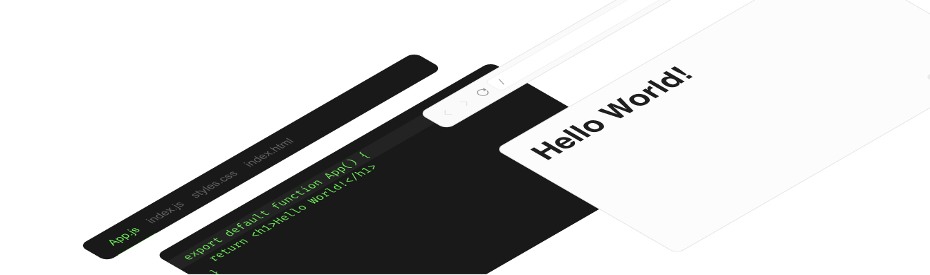
In this next section, you can read about all the different options for customizing the UI of the Sandpack components that render inside the <Sandpack /> preset.
Styling
Theming controls the color palette and typography, but you can also append your own custom style to existing Sandpack components.
For this, sandpack uses a small package called classer. To customize existing components, you need to map your own classes to the internal sandpack classes. So, while inspecting your Sandpack instance, notice that our components have classes prefixed with sp-.
<Sandpack
  theme={theme}
  template="react"
  options={{
    classes: {
      "sp-wrapper": "custom-wrapper",
      "sp-layout": "custom-layout",
      "sp-tab-button": "custom-tab",
    },
  }}
/>This pattern is compatible with most modern styling systems, including Tailwind, styled-components and emotion.
Bare components, remove runtime styling or use unstyled components
@codesanbdox/sandpack-react relies on @stitches/core to style its component, which is almost zero-runtime CSS-in-JS framework. However, if you want to get rid of any runtime script or create your own style on top of Sandpack components, we provide a way to return unstyled components, which will eliminate all Sandpack CSS style.
To do it, you need to consume the same components from the unstyled subfolder, which doesn't contain the Stitches dependency. For example:
import { Sandpack } from "@codesandbox/sandpack-react/unstyled";

const App = () => {
  return <Sandpack />
};
Themes
The overall style can be set through the theme prop. Sandpack offers a set of predefined options, but individual values can be passed to customize the style of your Sandpack instance. Access the links below to see all themes and learn how to customize them.
All themes
See all themes available on @codesandbox/sandpack-themes and how you can use it
Sandpack Theme Builder
Design and customize your own theme, among other Sandpack presets.
Options
Some of the internal components of Sandpack can be configured via the options prop.
Layout mode
The Sandpack preset component offers three layout modes:
- preview: (default option) which renders an iframe as a preview component;
- tests: which renders a suit-test component;
- console: which renders a terminal/console component instead of the preview.
Editable example
import { Sandpack } from "@codesandbox/sandpack-react";

export default function App() {
  return (
    <Sandpack
      template="node"
      options={{
        layout: "console", // preview | tests | console
      }}
    />
  );
}
Preview
Navigator
By default <Sandpack /> will show a refresh button in the lower part of the preview. Using showNavigator you can toggle on a full browser navigator component with: back, forward and refresh buttons as well as an input for the URL.
Editable example
import { Sandpack } from "@codesandbox/sandpack-react";

export default function App() {
  return (
    <Sandpack
      template="react"
      options={{
        showNavigator: true,
      }}
    />
  );
}
Preview
Tabs
File tabs are shown if more than one file is open. But you can force tabs to always be shown/hidden with the showTabs prop. On top of that, the closableTabs prop allows you to add a small close button for each tab, which removes it from the list.
Editable example
import { Sandpack } from "@codesandbox/sandpack-react";

export default function App() {
  return (
    <Sandpack
      template="react"
      options={{
        showTabs: true,
        closableTabs: true,
      }}
    />
  );
}
Preview
Editor Settings
There are a few different props for the code editor. showLineNumbers and showInlineErrors will toggle on/off some of the elements of the editor component. By default, line numbers are shown, but errors are not highlighted inline.
One useful configuration is the height of the component. We recommend fixed heights, to avoid any layout shift while the bundler is running or as you type in the editor or switch the tab. By default, the height is set to 300px, but you can adjust that with the editorHeight prop.
Finally, you can specify the distribution between the width of the editor and that of the preview. The <SandpackLayout /> component arranges the two in a flex layout, distributing the space between the editor and the preview according to this prop. A value of 60 for the editorWidthPercentage will mean the Preview gets 40% of the space.
Editable example
import { Sandpack } from "@codesandbox/sandpack-react";

export default function App() {
  return (
    <Sandpack
      template="react"
      options={{
        showLineNumbers: false, // default - true
        showInlineErrors: true, // default - false
        wrapContent: true, // default - false
        editorHeight: 280, // default - 300
        editorWidthPercentage: 60, // default - 50
      }}
    />
  );
}
Preview
Autorun & auto reload
autorun
Determines whether or not the bundling process should start automatically for a component in Sandpack. By default, when the component gets closer to the viewport or when the page loads and the component is already in the viewport, the bundling process will start automatically. However, if this prop is set to false, the bundling process will only start when triggered manually by the user.
autoReload
Determines whether or not the component should automatically reload when changes are made to the code. When this prop is set to true, any changes made to the code will trigger an automatic reload of the component, allowing the user to see the changes immediately. However, if this prop is set to false, the component will need to be manually reloaded by the user to see the changes.
Editable example
import { Sandpack } from "@codesandbox/sandpack-react";

export default function App() {
  return (
    <Sandpack
      template="react"
      options={{
        autorun: false,
        autoReload: false
      }}
    />
  );
}
Preview
Init mode
The initMode prop provides a way to control how some components are going to be initialized on the page. For example, <SandpackCodeEditor /> and the <SandpackPreview /> components are quite expensive and might overload memory usage, giving a certain control of when to initialize them.
- immediate: loads right after the Sandpack instance is created;
- lazy: loads when the Sandpack instance is close to the viewport and keeps it running (this's the default value);
- user-visible: loads when the Sandpack instance is close to the viewport, but different from lazy, it destroys all instances when it's out of the viewport and mounts again when it's close to the viewport;
<Sandpack
  options={{
    initMode: "user-visible",
    initModeObserverOptions: { rootMargin: `1000px 0px` } // `IntersectionObserverInit` options
  }}
  template="react"
/>
Recompile Mode
The recompileMode option also allows you configure what happens when the user starts typing in the code editor. The immediate mode will fire the change to the bundler as soon as it is received, while the delayed mode will debounce the bundler operation until the user starts typing. Optionally, you can set the delay for the debounce, which by default is 500ms.
By default, the mode is set to delayed to ensures the bundler doesn't run on each keystroke. You can customize this experience by modifying the recompileDelay value or by setting the recompileMode to immediate.
<Sandpack
  options={{
    recompileMode: "delayed",
    recompileDelay: 300,
  }}
  template="react"
/>
Resizable panels
The <Sandpack /> preset component has resizable columns and rows by default, allowing users to extend and shrink the component sizes. This makes it easier to play with the preview component and shows more code-editor content. However, this is an optional configuration, and you can easily disable it:
<Sandpack options={{ resizablePanels: false }} />Other components (SandpackProvider for example) do not have this functionality and it must be implemented by the user.
Right to left layout
Editable example
import { Sandpack } from "@codesandbox/sandpack-react";
export default function App() {
  return (
    <Sandpack
      options={{
        rtl: true, // default false
      }}
    />
  );
}
Preview